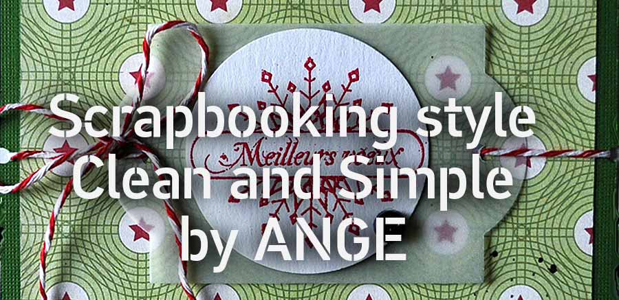
SCRAPBOOKING CLEAN AND SIMPLE By ANGE

![]()
How long do you scrap ?
Since end of 2005 or thereabouts.
Immediately I liked that, it became a passion.
What do you prefer to Scrap?
So many things ! I particularly enjoy discovering new techniques with my software and learn to work with my photos.
I enjoy also to discover the new designs kits : when I download one and I open it, it's like I opened a big gift package!
And the kits are constantly evolving, in search of novelty, it allows me to be always "on top" (if I may say so!) and to renew my creations. I am merely trying to follow the move...
What are your favorite colors?
I have four colors that often recur in my scraps : pink, blue and brown. I like the maroon too, even if I scrap less with that color.
What brings you scrap?
The scrap has taught me to be creative. He showed me this pleasure in creating and especially that of being satisfied with my work. I learned to start so many things about myself . But more concretely, I discovered the world of photography and processing software files, thanks to the meetings I have done on the net.
The world of scrap on the net is like a big family where we help one another, we share and we improve ourselves!
And finally, to be able to capture moments of my life in scrapping my family , it's still a pretty good goal!
In summary, the scrap is for me far more than just an entertainment, it is an art in itself which awakes in me mixed emotions and gaves me the impression of being at my place, in my element.
My greatest satisfaction is all about giving pleasure to others when they come on my blog and spend a pleasant time looking at my creations.
Visit the Angelique's blog:

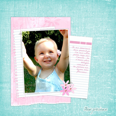
 Clean & Simple ... What is ?
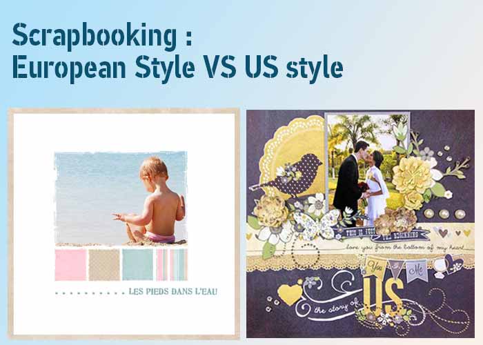
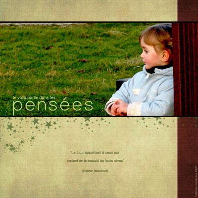
The clean and simple style (C & S) is easily identifiable : it is a pure page , smooth, where everything is in place and is held in perfect balance.
This style falls into the category of European scrap totally opposed to the U.S. scrap style.
 SEVERAL STYLES C & S
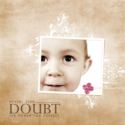
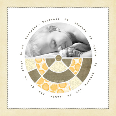
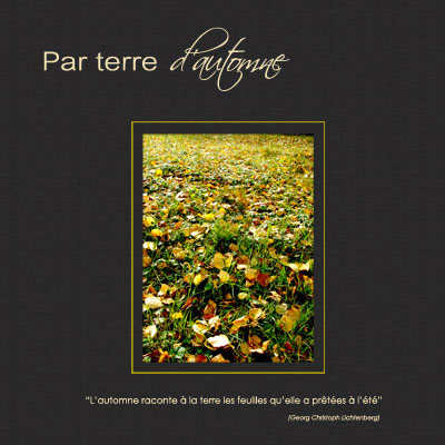
![]() The "pure" C & S can be compared to a page of advertising. Not textured papers, just a plain background, one or more photos that occupy the principal placeon your page and a "clash title", highlighted, often accompanied by some journaling. You must imagine that your page can be published in a magazine.
The "pure" C & S can be compared to a page of advertising. Not textured papers, just a plain background, one or more photos that occupy the principal placeon your page and a "clash title", highlighted, often accompanied by some journaling. You must imagine that your page can be published in a magazine.
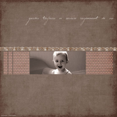
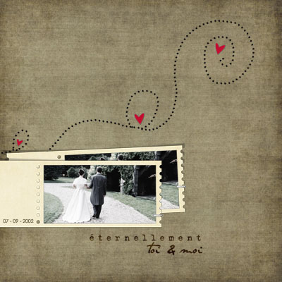
![]() The C & S base, with the use of patterned and textured papers , some basic elements (frames, doodle, WordArt, ties ...) one or more highlighted photos , a title and often a journaling ..
The C & S base, with the use of patterned and textured papers , some basic elements (frames, doodle, WordArt, ties ...) one or more highlighted photos , a title and often a journaling ..
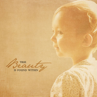
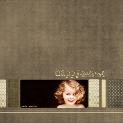
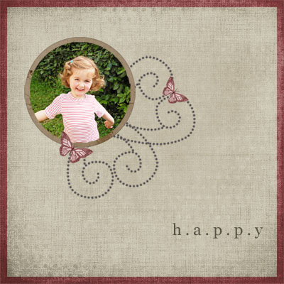
![]() The C & S with a vintage effect. Reworked photos, papers with past look, always very sober, a few of elements, most often doodles or WordArt, one title and / or sometimes a little text.
The C & S with a vintage effect. Reworked photos, papers with past look, always very sober, a few of elements, most often doodles or WordArt, one title and / or sometimes a little text.
 THE SECRET OF C & S
The secrecy in C&S they is : the photographs.. The C & S seeks to sublimate the photos. All the elements are around only for highlight it and not to stifle it.
Cropping, recutting a photo is already a first technique to use.
Then, for digital scrapbooking there is the blurring and all images effects (desaturating, resharpening, inlaying ...).
 THE BASICS OF C & S
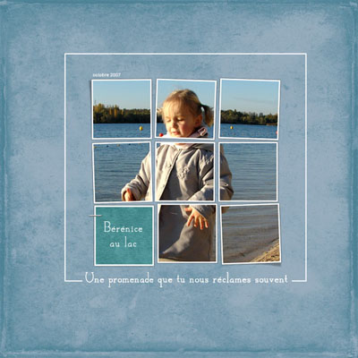
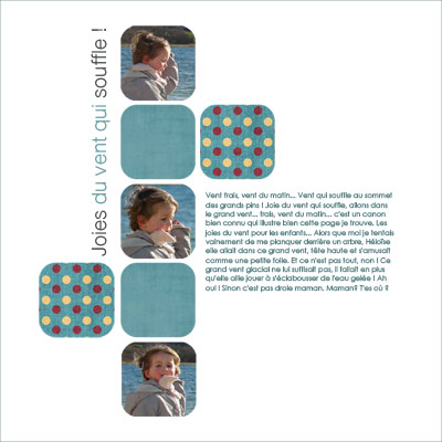
A very simple model: the mosaic. Photos and papers, all on plain background.
It is a page called "graphic" with simple and pure lines.
The mosaics can go from very simple to rather complicated patterns.
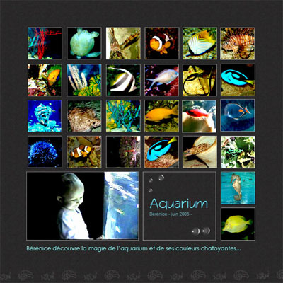
We continue with the mosaic effect
 The basics
- The Frames. The easiest way will do! It is often more elegant and more "class". Don't use beveled effect frames for example. Just a simple border is sufficient to embellish the picture.
- Fasteners : Staples, stitching, paper clips ... Everything is permitted, as long as they remain discreet and well proportioned.
Decorative elements:
- All elements must be related to the theme of the page.
- The doodles and Wordarts are the favorite items in C & S. Discrete, elegant, refined, they provide a key "pro" to the page.
 The title and journaling
The title as the journaling hold a great place in C&S. They are regarded as imporatnt elements in themselves. Therefore they must be eye-catching without too attracting attention; you must keep the harmony and balance as a first rule of C & S.
- The title sums up the theme of the page. The page tells a story, sometimes a title by itself is sufficient to tell all that story.
- The journaling helps to deepen this theme : either describing this moment of our life that represents the picture or quoting poems, known texts or songs that we like and which illustrate our theme.
Sometimes, journaling can have a more greater role than the photo. This allows us to remember moments that have counted in our lives.
Conversely, a single sentence may suffice to summarize the theme of the page, without need of a title or a long journaling.
- The choice of the font is very important, especially for the title. It allows us, before having read ii, to be into the mood of the page.
- For the journaling, you should use fonts without serifs or with serifs for a clean effect, often professional one.
- Cursive or script Fonts for a manuscript purpose.
And finally, other fonts to recall the theme of the page, such as the effect of "typewriter" for a top vintage page.
 What you should avoid
The papers too textured or with too imposing reasons which would stifle the photographs. Or at least, don't make the page coarser such as:
All the "frills, flowers, ribbons and others are unnecessary elements. Always go easier for lightness and clarity.
The poorly framed photos: always come to this point : what we want to show ? Frame the subject for a close-up.
For a broader level, ensure that space is placed before the subject for more movement and for its looking to the future .. Avoid "focused" photos.
![]()
Clean and Simple
Scrapbooking (Paperback)
Cathy Zielske
Clean and Simple Scrapbooking, hit the shelves !
Learn more about ideas for good design and good journaling as well as how to feel comfortable in your own scrapbooking skin. Amazon's best selling.
Clean And Simple
Scrapbooking)
Cathy Zielske (Author)
Ideas for Design, Photography, Journaling...
Now you can learn to think like a graphic designer.
Scrap Simple: (Paperback)
Hillary Heidelberg
Using Minimal Design to Create Beautiful Scrapbook Pages...
Enter Scrap Simple.
In this book, readers will learn how to create great pages using just a handful of basic products.
Picture Yourself
Creating Digital
Scrapbooks
Lori J. Davis
Shows you how to incorporate traditional and contemporary graphic design principles to create print and digital scrapbook projects using your digital camera, computer, and popular graphics software...