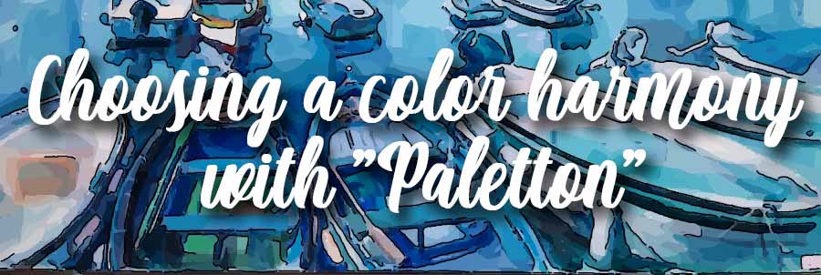
PALETTON SOFTWARE
How to easy choice a COLOR HARMONY
This is the puzzle of all decorators ... how to choose and match the colors of an interior design...
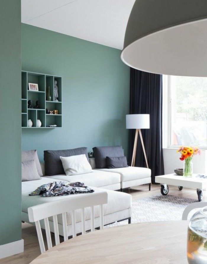
For the picture framer, the problem is even more acutely: the framed art, the mat and the frame itself must form a harmonious whole that must be integrated with the existing decor. For this we must commit no error in the selection and approval of the colors.
The PALETTON software
There was previously a handy program to identify color harmonies ... It was the COLOR SCHEME DESIGNER ... This program has been perfected, its ergonomics ccompletely revised and now is a success! This almost magical program is the PALETTON .
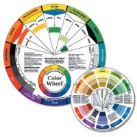
This imply you have a little knowledge of color theory ... if it is not the case, you will find here a page dedicated to this subject ... Obviously, the use of this program is free and devoid of any unwanted advertising!
Then go with me to the page http://paletton.com ... I will explains how it works.
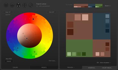
Choose your harmony
You will first select the type of harmony you want to get ... monochromatic (camaieu), adjacent colors, contrasting colors, 3 or 4 tones ... by clicking one of the indicated options. Don't forget to mention or not the "complement" option (it's for contrasting colors).
base
Select the main base color
Base color must now set for your harmony ... To do this, click on the black point in the color wheel and move it to the desired color ...
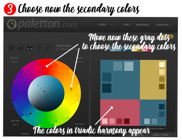
Choice of associated colors
By clicking and moving the gray points of the color wheel, you choose your appropriate secondary colors ... To obtain a color harmony, the 3 points ont the color wheel must form an isosceles triangle... this harmony is perfect when it becomes equilateral.
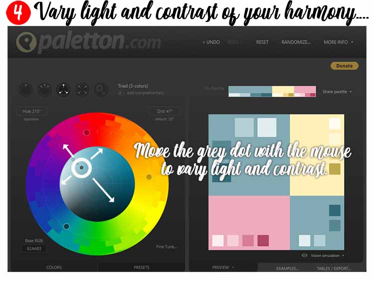
light settings
it only remains to adjust the sharpness and contrast of your harmony ... For this, with the mouse, move the focal point in all directions
You read directly results in the right part of Paletton ... Your harmony and its different shades instantly appearing there
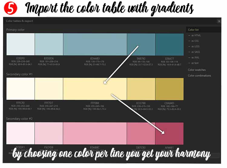
Your colors in harmony
You get by clicking "Color Table" a chart of your colors ... with their html codes, RGB, CMYK ...
One regret, RAL values are not shown
If you choose one color per line, in different intensities you will have, in pastel or more acidic tones, the harmony of 3 colors that you want...
1) The Complete Color
Harmony Workbook:
Kiki Eldridge (Author)
A Workbook and Guide to creative color combinations...
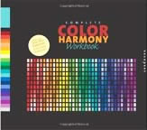
This book provides readers with the color inspiration and information to achieve communicative results...
2) Color Harmony
Workbook:
Lesa Sawahata (Author)
An another workbook and guide to creative color combinations.
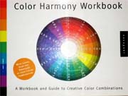
The Color Harmony Workbook is a practical, visual guide for choosing and using color combinations.
Color Design Workbook
AdamsMorioka
A complete and real world guide to using color in graphic design.
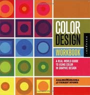
The science behind color theory is also explained in easily understood language.