The LOULOU's scrap !
How long have you practise digi-scrapping?
Since July 2008. I started a few months before the manual scrapbooking, but I quickly became tired with the unpacking: glue, paper, scissors, templates, brads and other embellishments ... digital scrapbooking was a wonderful discovery! I started digi traditional and evolved gradually into the clean and simple style .
What do you prefer in Scrapbooking?
Even before knowing the Scrapbooking, I was already fascinated by the image processing, and I started doing photo montages. The Scrapbooking allowed me to go further.
I like to scrap the human faces, but also sea and boats. And of course my old family photos.
Now I am passionate about achieving kits: matching colors, finding embellishments, sometimes drawing them, possibly aided by my son who is an architect , but also an artist (paintings) in his spare time, while I like a lot.
Do you have favorite colors?
Generally, I like bold and bright colors, and I love contrasts.
I am less attracted to pastels, unless they are associated with brighter colors.
Strangely some colors like purple and do not please me in digi-Scrapbooking!
What brings you scrap?
The absolute relaxation. Meetings, on some forums or galleries, with other Scrappers, trade, new friendships being created, discovery of other kits, that is really rewarding!
And your blog?
The pleasure of sharing. A new kit (still freebie, no question of doing otherwise!) which is successful, pages appreciated by visitors, nice comments and encouragements while it delights me!
Contact: Scraploulou@hotmail.fr
The Loulou's site ...
http://loulou-scrap.over-blog.com/
This site is truly a nice discovery
Everything is dedicated to digi-scrap and Loulou share with coolness all his creations ...Do not miss the freebies section of its site that is truly a breakthrough ... no tinsel, no eye-catching: only a content ... and a good one!
Among the many kits she offers for download, here are 4 that I particularly appreciated.
You can click on the pictures they draw you directly to the right place!
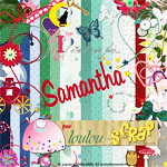 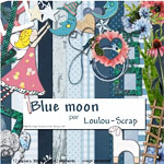
Samantha Blue Moon
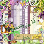 
Sweetness of a summer 2010 Hello
Loulou thank you again for this great work and sharing!
The step by step tutorial
We are always in search of special effects to better highlight our images ...
Among these, here is a particularly aesthetic effect that will help to highlight a detail that would otherwise have been lost in a photo!
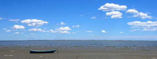
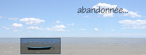
Loulou start with this very nostalgic image:

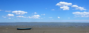
And she obtains:
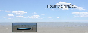
The feeling of loneliness but also of latent tragedy are particularly highlighted by the focus on the boat lying on the sand!
It's Art!
How to do...
Here is a step by step, very simple, but this technique gives results that are generally highly successful and are very aesthetic.
Moreover, this "tutorial" allows to become familiar with the "layers".
Choose a photo that you want to emphasize a point, or characters a so ... for example thereof. This is a picture of Claude de Garam, coming from the 'banque d’images libres de L’Internaute"
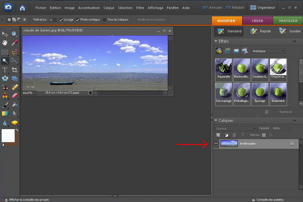
Open the photo with Photoshop Elements. It appears in the Layers palette, as' background.

(click for +)
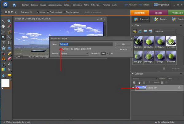
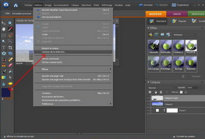
We must transform it in a layer for "work". To do this, double click on its thumbnail, a dialog box opens, rename the layer if you want, then OK.
We will keep the name "Layer 0", because we have only 2 layers, so no risk of confusion.

(click for +)
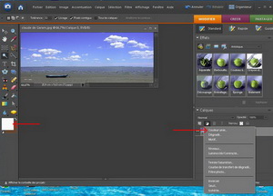
As we work on transparency, for more readability during the execution of our page, we'll add a white background. The white color is selected (left of the screen), click on "create the adjustment layer" and "solid color".
|
(click for +)
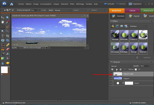
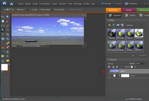
Raise Layer 0 above the white background, we get this:
(click for +)
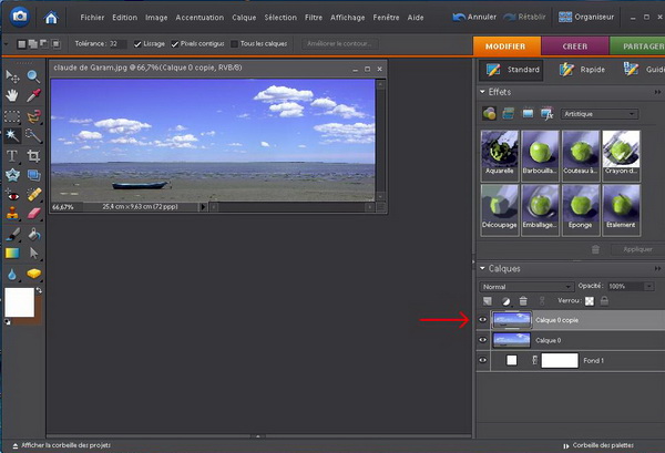
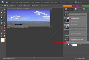
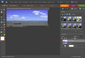
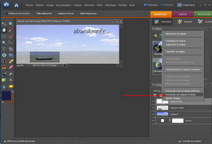
Duplicate the layer 0. To do this, right click on the thumbnail, then "Duplicate Layer"
(click for +)
This layer is called "Layer 0 copy. OK. We obtain :

(click for +)
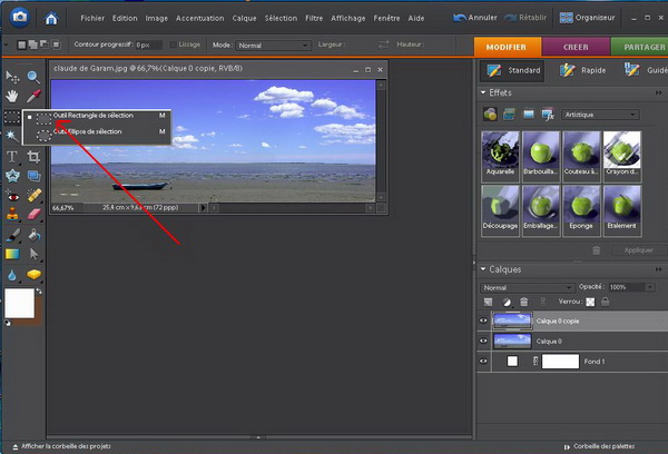
On the screen we see only a picture, this is normal since they layers are stacked! Note that the layer on which you work is surrounded by a white frame in the layer palette.
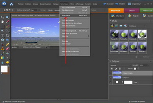
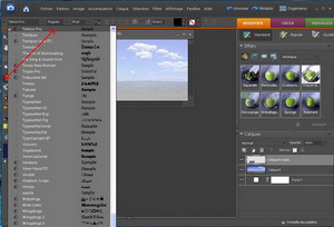
Stay on the Layer 0 copy. In the toolbar (left of the screen), select the rectangle selection

(click for +)
With the mouse, draw a rectangle around the object that we want to highlight, then click on "selection" "reverse"
(click for +)
Click on keyboard "delete". Then ctrl + D to remove the dotting lines. And then ... You think that nothing happened! A little patience! Look carefully at the in the layers palette!
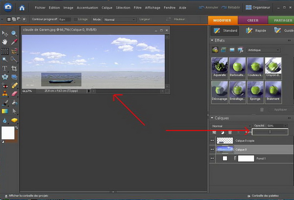
(click for +)
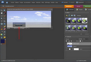
Return on layer 0 (click on layer 0 in the layers palette). Click on "opacity", and drag the cursor to the desired effect within 50%.

(click for +)
You're done!
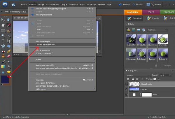
If you want to improve your page, you can add a stroke to your selection, and text.
Choosing the pipette with a color, for example a color found in the selection, then click "edit", "stroke selection.
(click for +)
A dialog box opens. Choose the thickness, then OK. And you have:
(click for +)
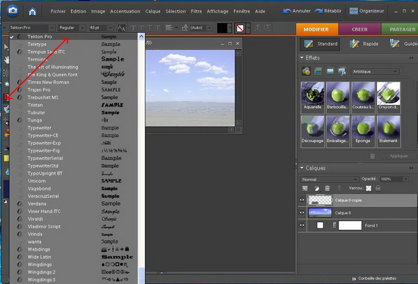
You can stay in the same layer to type the text. Click on the T in the toolbar, select the font and size, write your text:
(click for +)
Finished! You still have to merge: Right-click the top layer, here the text layer, then "merge visible".
(click for +)
Your digi-scrap photo is finished! You have to save as a Jpeg picture. And here's the result:
(click for +)
GOOD SCRAP!
|