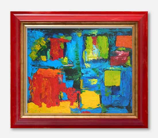
Creating harmony of colors
using the color scheme designer!
You have pictures or drawings to be framed... and inevitably raises the problem of choosing the color of the bevel, of the mat and of the frame ! You are doing again your living room decoration... and you are unsure about the tone of the curtains... You do not know how to choose patterned papers for your scrapbooking page : you're afraid making mistakes...
To create color harmonies ... Here's the problem ! Some among you have no trouble to feel instinctively the colors to match ... others on the contrary feel stripped at choosing the colors time.
If you belong to the second category ... don't worry : COLOR SCHEME DESIGNER is a magical tool that will greatly simplify your life!
 Brief history of color theory ...
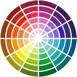
Everyone knows the color wheel : it is formed by the three primary colors(yellow, blue, red), three secondary (obtained by mixing equal parts of three primary green, orange and purple) and the 6 tertiary colors .. .
On this color circle, we say that two opposite colors are complementary: for example, yellow and purple are complementary ... Similarly, the blue and orange are also complementary.
Harmony based on complementary colors.
In the theory of color harmony, they say that the human eye, in the presence of a color, research subconsciously its complementary : where the idea of two complementary colors form a harmonious combination.
For example:
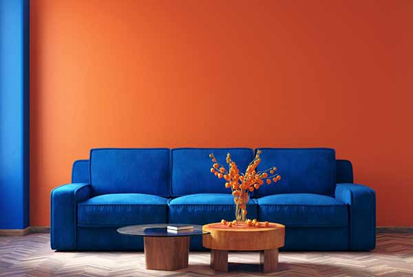
The ORANGE color can be harmoniously combined with its complementary color, blue, available here in different saturations.
The contrast obtained is maximum but without being disagreeable! It is a 2-tone harmony.
Harmonies with several shades
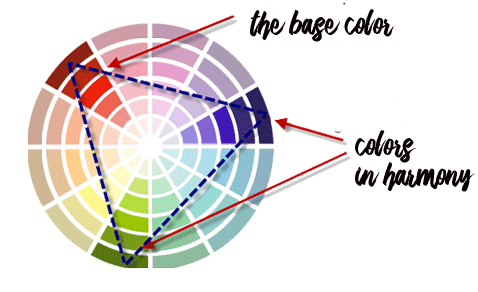
3-tone harmony : It's an harmony that will combine three colors forming an isosceles triangle on the color wheel (triadic harmony)
Simply choose a base color and draw an isosceles triangle on the circle. In the example, the base color is the CAPUCINE (tertiary color red-orange). The drawn triangle is isosceles (equilateral!) and the color harmony will be: yellow sulfur (yellow-green) and indigo (blue / purple) ...
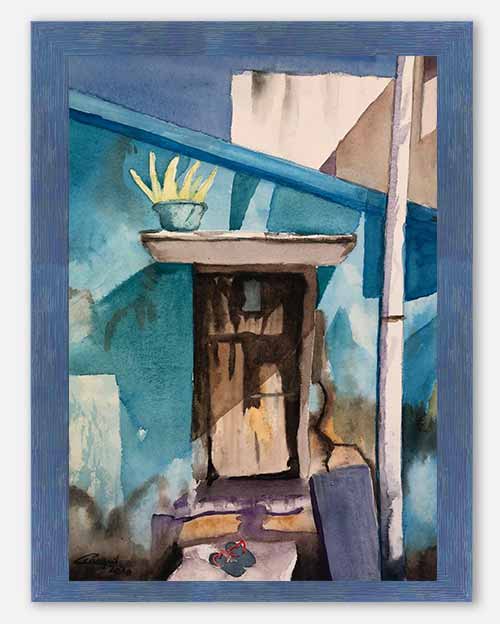
When framing pictures, it is necessary to dare the more marked colors and not to hesitate to create contrasts
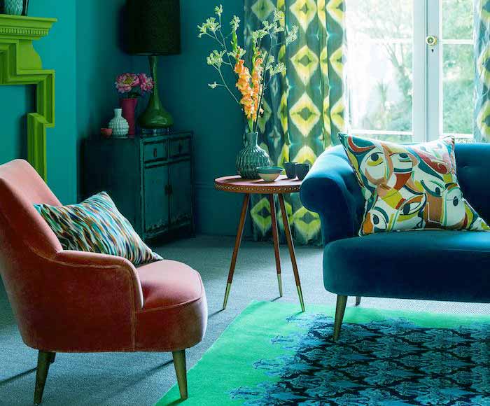
Harmony 4 shades: It is a harmony that will combine four colors forming a rectangle on the color wheel.
Thus, in this example, are associated red orange (capucine), purple, turquoise and sulfur yellow...
These harmonies are a little more delicate to implement: balance is an essential condition. Choose a dominant color and distribute the 3 others by discrete touches.
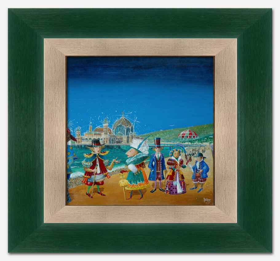
For this print, we chose a marie-louise that reminds the sand in the background... and a frame with green tones in agreement with the hill in the background...
.
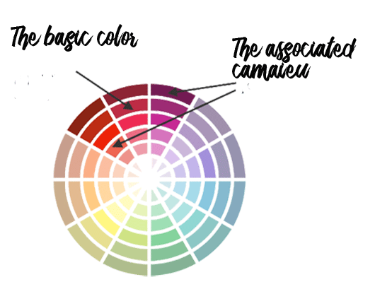
Tonal Harmony (camaieu)
Here, we choose close colors on the chromatic circle :
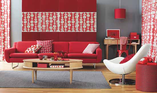
Here, the Camaieu is obtained by combining red with capucine and purple ... Not easy to transpose in an interior... To be moderated with softening greys.
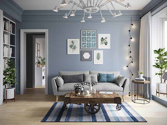
It's easier with grayish blue tones that give a cooler, but more conventional interior!
The frames in camaieus lack a bit of punch... they are nevertheless frequent because they are reassuring.
Other harmonies ...
There are other techniques for obtaining color harmony (... You will discover them by experimenting with the PALETTON by testing its possibilities.
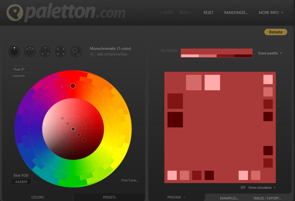
The Paletton Color Scheme Designer
It's a little online Flash program that will allow you to find your different color harmonies without difficulty and without annoying calculations.
For a basic color chosen, it provides in different saturations, the colors that match the harmony you have chosen.
You can find this paletton HERE!
After choosing the type of harmony, the basic color and possibly the secondary colors, you will be able to vary the light and contrast to obtain your range of colors... Complete tutorial HERE
Click HERE to see all the books about COLOR HARMONY
There are dozens and dozens of books about color harmony.
And it is not easy to choose among all these books... Here is a personal selection of those who seem the most simple and comprehensive...
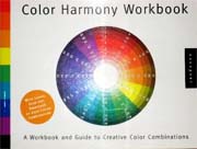
1) The Complete Color
Harmony Workbook:
Kiki Eldridge (Author)
A Workbook and Guide to creative color combinations...
Like the rest of the best-selling Color Harmony series, this book provides readers with the color inspiration and information to achieve communicative results...
2) Color Harmony
Workbook:
Lesa Sawahata (Author)
An another workbook and guide to creative color combinations.
The Color Harmony Workbook is a practical, visual guide that takes the guesswork out of choosing and using color combinations.
Easy to read and complete handbook.
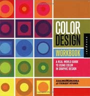
Color Design Workbook
AdamsMorioka
A complete and real world guide to using color in graphic design.
The science behind color theory is also explained in easily understood language.
