
How to arrange your paintings!
Find THE place of your frames!
Frames, paintings, framed sketches, photos are the end point of a successful decoration. They are the true reflection of your personality.
As much find a place for a picture on a wall is easy ... so find him THE place is delicate and requires thought!
So how do you do when it comes to grouping several frames next to each other? How to arrange them to have a harmonious whole?
Answering this last question immediately awakens the quarrel of "old" and "modern": supporters of classic alignments immediately oppose fans of more modern and diverse provisions ...
Let's not go into controversy and give great principles ... Everyone will get what he needs and then act according to his tastes!
 Group your paintings!
To succeed a good frames layout we must reconcile two opposing principles : unity and diversity !
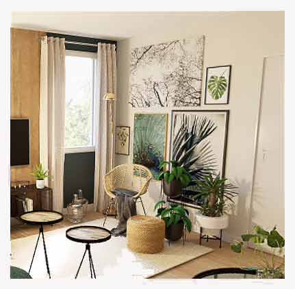
Create groups of frames by theme: subject, color, materials, shapes... This will already give a certain unity to your exhibition.
The subject ... landscapes, portraits, family memories, pencil drawings, images of flowers or birds ...
The color ... intervenes as much as the frames of the subject. This color must be in harmony with that of the room in which you will hang ...
Materials ... the same type of frame, the same type of support (oil, acrylic, watercolor, photo ...).
Shapes : all the frames are rectangular... by example !
Here, unity is ensured both by the color of the frames ... by their rectangular shape and what they contain: photos.
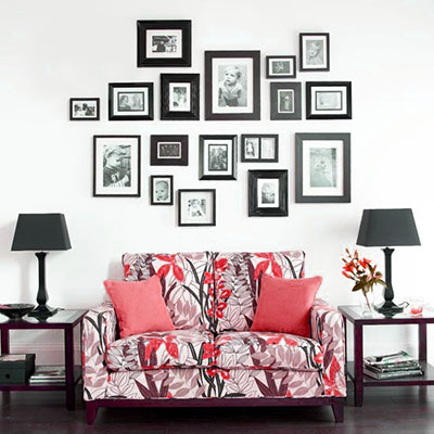
Dont forget to give a bit of diversity at the same time... It's the 2nd rule... have one or two odd frames to break the unity... because too much unity is monotonous and too much diversity is disturbing. You need balance for your lay out.
the picture above lacks a little diversity ... It would have been enough of a round frame and another of color to bring a little "peps"!
 Where to place the frames and how to illuminate
Usually, it is better, for obvious reasons of conservation, to avoid locations lit by direct light : some pigments (pastels in particular) would not resist. So ban the pitches facing south or facing a window.
In this picture, the lay-out is good but the frames are arranged in the direct light of the window ... don't place there fragile works like pastels for example.
If you want to illuminate your paintings, avoid lighting rich in destructive UV (halogens for example). Incandescent or energy saving lamps are still the best.
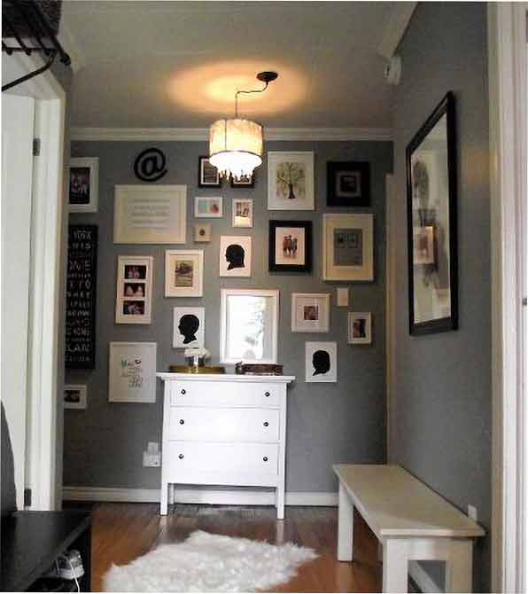
Avoid placing a small picture alone on a large piece of wall ... Find him instead a place between two windows, between two pieces of furniture ... and always center this isolated element in relation to what surrounds it. By cons, a large table can be perfectly in its place on a small piece of wall ... everything is a question of measurement.
We always tend to hang too high frames ... the right height is the one that puts the center of the board at eye level ... so approximately 1.65m from the ground!
Before hanging them, you can lay them flat on the floor to judge the effect.
 Online layout
The online layout is the most common way for picture frame layout...
In the horizontal line layout, the most classic is to center the frames on the same line.
This provision is the most commonly used. It gives relatively well balanced sets:
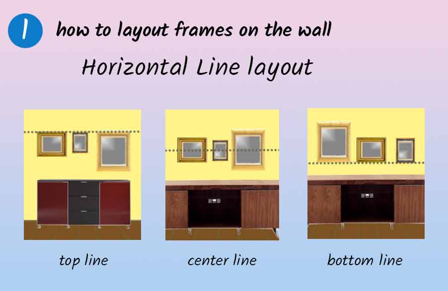
But you can just as easily choose an alignment of the outer edges up or down!
This will give a very modern invoice provided you do not abuse it.
In the same way, you can arrange the frames on a vertical line ... first centered on this line or, to attract the eye, aligned by their external edges (trend!):
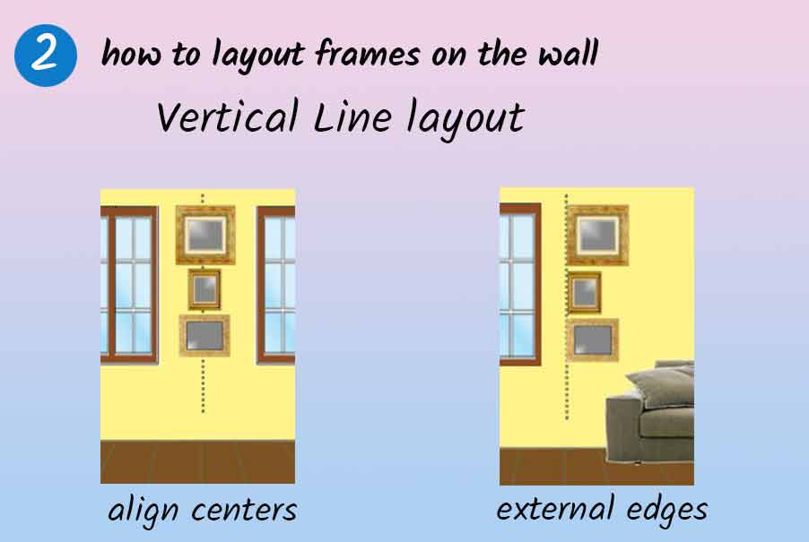
Remember that horizontal alignments visually "lengthen" the room in which they are, while with vertical line layouts the ceilings look higher. It's also a way of "correcting" the geometry of a piece ...
 Regular layout
If you have several identical frames or the same dimensions, bring them together and adopt a composition that will create unity ... The repetition of identical shapes will create a ryhtme that will animate the wall section where they are.
Reduce the distances between your frames while spacing them regularly (spread them with a "hand" ie about 9cm).
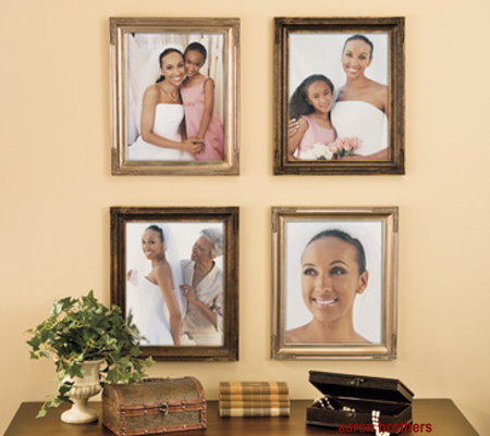
Form a line (3 frames) a square (4 frames) a rectangle (6 frames) ...
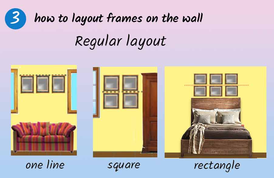
The bottom line is that the result is harmonious.
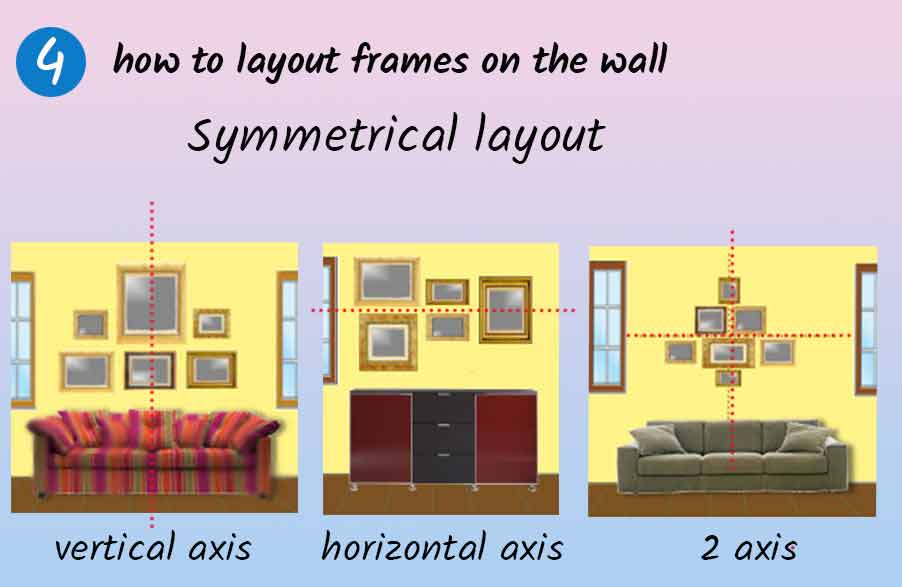
 Symmetrical layout
It is equally suitable for series of small frames with the same dimensions as for frames of different sizes. Frames are arranged symmetrically with respect to a vertical or horizontal straight line.
It is the ideal arrangement above a low furniture, a sofa ...
The symmetry can be vertical ... or horizontal or both....
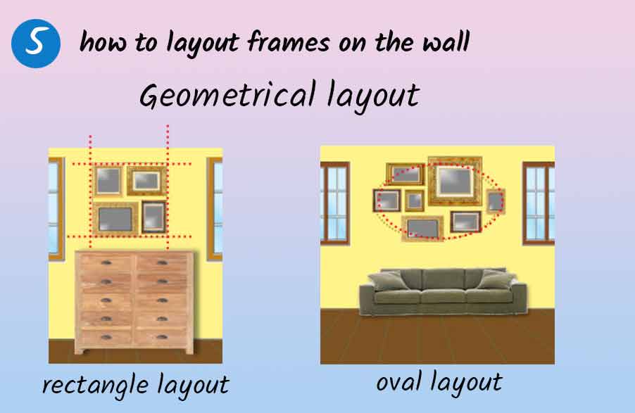
 Geometric layout
The intention is to group the tables inside a virtual geometric form that we guess by looking at the whole.
You can search for groupings in square, rectangle, oval, triangle ...
Here in square ... and in oval ...
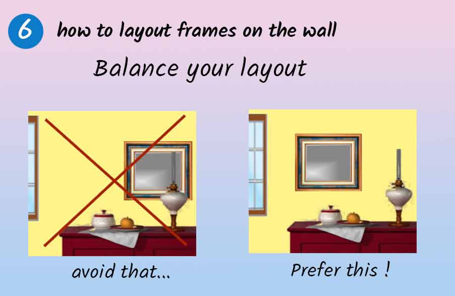
 Arrangement over a piece of furniture
In general, if a picture frame is placed above a low furniture (low sideboard, chest of drawers, sofa ...) then we center it in relation to this piece of furniture.
But in the case of dressers on which objects are already arranged, it is necessary to adopt a staggered arrangement so as to restore balance to the whole.
 And then...
And then everyone does what he likes ... that's why sometimes you have to go away from "classic rules" to further personalize your interior. I only gave you the principles: following them, you will not make mistakes ... but there is always a way to free yourself from the rules to create an impression of modernity!
Placing his paintings pell-mell without order or constraint, relying solely on his instinctive taste sometimes gives great results: it is enough to dare !!!
CONTINUE TO: How to hang a painting ...
ALIGN YOUR FRAMES ... a great little tool !!!