
HOW TO CHOOSE THE MAT COLOR ?
Choosing the passe-partout color : a problem !
 Mat or "passe-partout ?
In USA they call "MAT" what we call, in Europ "passe-partout" ! It's the same thing : a simple transition between the artistic work and its environment (picture frame, room ..)
When we frame a picture, the mat has a double purpose: functional and artistic.
The first is to prevent by the gap it creates, all contact between the work and the pane of protection (which could cause undesirable joining or moulds…).
(Java Draw Calendar)
Secondly, it serves to lead the eye to the artwork by creating a transition between it and its environment.
It can also draw attention to a particular color used in the art ... and particularly to emphasize this one. .
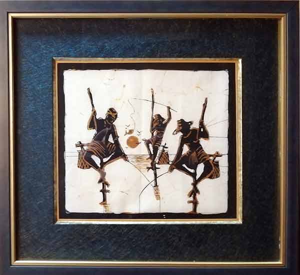
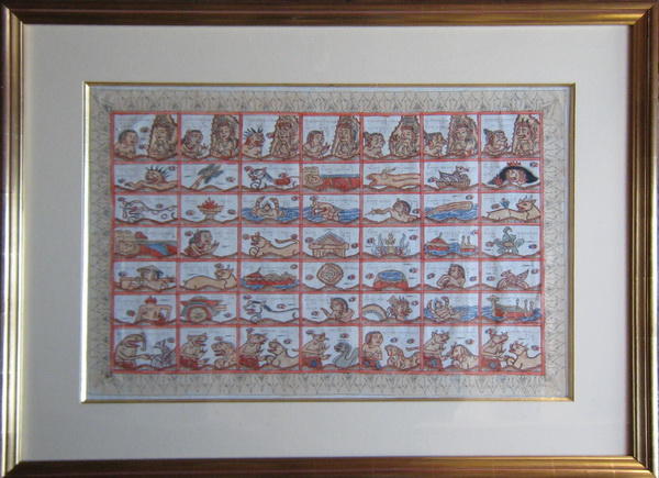
(Batik fron Sri-Lanka black mat)
 Give a neutral color to the mat !
You have a watercolor, a pastel or a print to frame ... And you ask yourself the question of the color to choose for the mat ... That's the problem ... Dreaded!
Do not look for a precise rule : as for all that is artistic, it is question of your personal taste and also the harmony with the place where you wish to hang your framing.
By adopting neutral colors : off white, shaded gray, cream, beige ... you are certain not to go wrong. These colors do not attract attention to themselves and are particularly highlighting art and its colors.
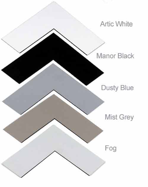
In the colors above, the black color gives a pretty violent transition, not always easy to use!
Take as an example ... this full colored painting has a strong dominant in green ... whose framing certainly will pose problems of harmony of colors.
If we choose a off-white mat:
- "Hmmm!" This is not too bad ... but it's not very classy! If we had a black edges, it'll be better... An additional "English bevel" darker for the drawing more stand out?
The first rule is : you never make a mistake by choosing an off-white color passepartout !
No mistake, the result is passable but have not so much decorative interest ... It's neutral!
And it is precisely because of this neutrality that this kind of mat is commonly used in museums where there is not question of decoration ... but only just to present a artwork. But this is not satisfactory ... there might be ways to get better! We will at least have this solution if we do not find another.
We've tried other grey colors for the mat... Not very good...
If you lack inspiration or if you are afraid of making mistakes in the juxtaposition of colors, you can adopt an off-white mat style : it suit anywhere.
 Consider the colors of the art...
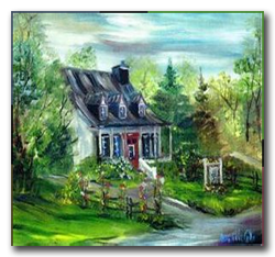
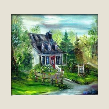
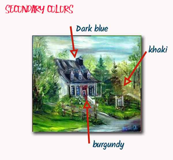
Let's start by determining the colors contained in this painting:
![]() The dominant color is green, present in different shades on practically all the surface. The secondary color is dark bluish gray found in the roof in the house front and on the road. Then we found some third order colors : blue, maroon and brown ...
The dominant color is green, present in different shades on practically all the surface. The secondary color is dark bluish gray found in the roof in the house front and on the road. Then we found some third order colors : blue, maroon and brown ...
Usually it is better for the mat to avoid selecting the dominant color of the art ... Look what could happen with a green passe-partout:
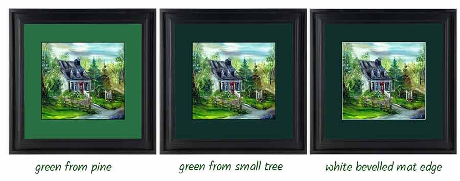
The result is not good ... The image does not "come off" its frame. A special mention for the small white edging of the third mat that alleviates a little bit.
The second rule is : Avoid, if it is possible, a color for the mat which is the dominant color of the painting.
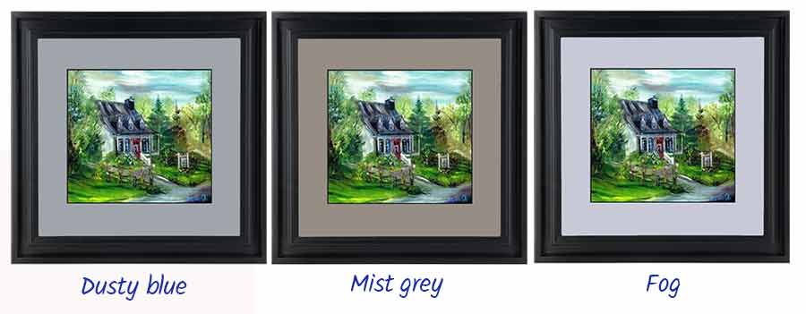
![]() We have now to try the secondary colors for the passe-partout...
We have now to try the secondary colors for the passe-partout...
I deliberately forget (by experience) the light blue of the sky as well as the shades of very light green found everywhere... So we try only the blue, burgundy and Khaki...
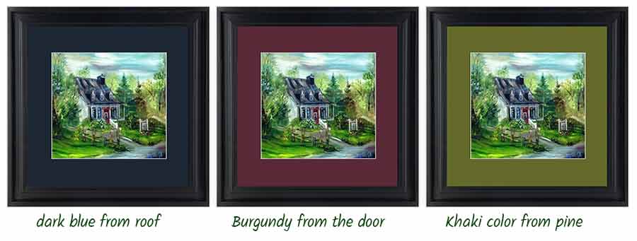
Dark blue is good as well as burgundy that are good choices ! For me, I retain the blue one... Is this also your opinion?
The third rule is: Choose for the mat color a secondary color, but try it before !
 2 Colors Passe-Partout Tests
It is possible and sometimes giving a good result to mount with 2 passe-partout... They are placed one above the other, One with a large opening, the other with a smaller one.
I tried many combinations ... Here are the ones that seemed to me the best. It is a matter of personal taste and harmony with where the painting will be placed.
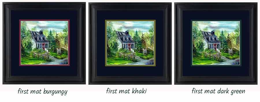
And my preference is : first mat khaki !!!
It is the one that seems to me the best balanced: all this is very relative and you can perfectly have a different opinion because you will live with this table at home! Remember that the rules are made to set limits and that the limits are quickly crossed!
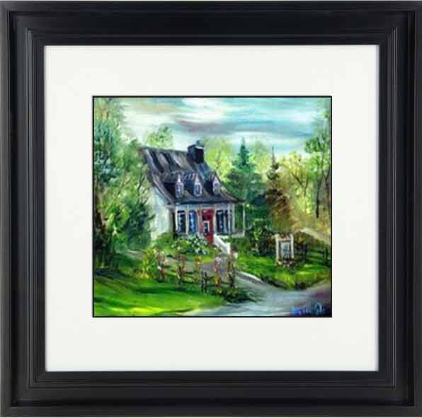
It remains now to find the good frame for our matted painting! And that is an another story !
 Help to choose your colours...
To easily determine what are the dominant colors of a painting or a watercolor, you can use these small applications found on the PlayStore (for those who have such Android) or AppleStore for others ...
You have a very wide choice: all these applications are so similar that the first one you load will be the right one !
The operating principle is simple: you take a photo of your art, the software analyzes this photo and gives you the list of colors in the photo. So you will have no trouble determining the dominant color and secondary colors ...
To frame this art, we want to implement a "Marie-Louise". The Marie-louise is a sort of intermediate frame placed between a framed art without glass (usually a painting on canvas or other support) and the frame itself
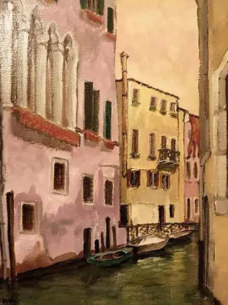
Today I use the site toolki.com to determine the colors of this acrylic painting of Venice ... And that to determine the color of the "marie-louise" which will make transition from framework to art. It's very simple: just upload the art on the site and we immediately get the 5 or 7 most common colors.
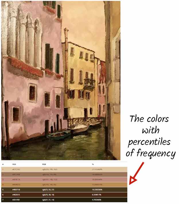
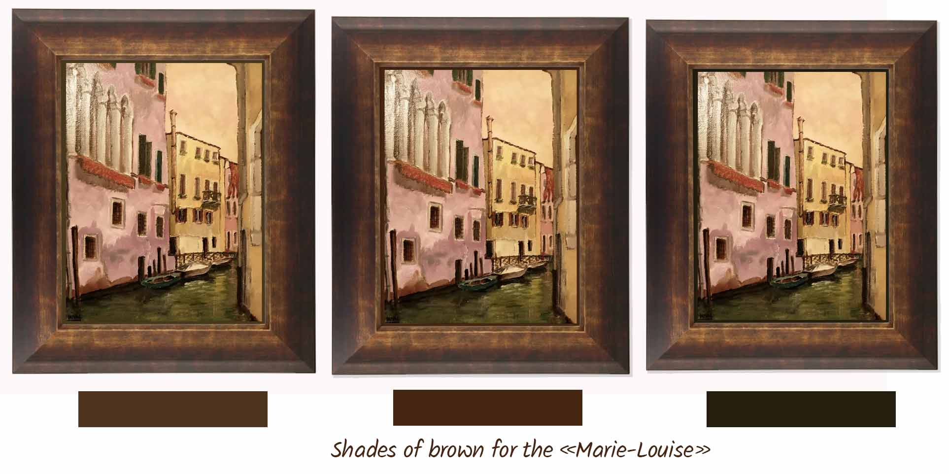
So we can choose among the last 3 colors : shades of brown and try them with the picture frame...
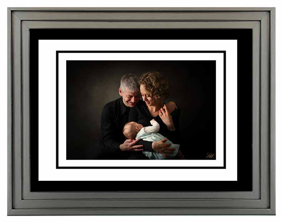
 And for an art photo...
In general, the art phtographers do not look for the complication in their exhibitions: the matt covers are very sober, black or white, with, sometimes, a small border of the opposite color. This simplicity makes it possible to forget the framing to concentrate on the work itself...
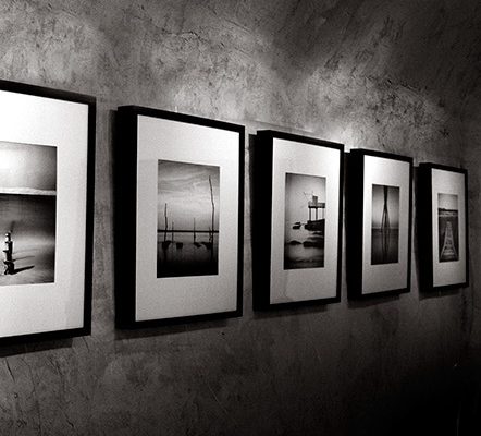
When the photo is dark, a black mat with a small white border is very elegant and gives these frames a very contemporary look.
 This
This
All this is a very sober and the result evokes both elegance and refinement. The codes are clear: all is implemented to center the glance on the photograph.
And the method is effective because it works even with color photos ... The black border highlights the colors of the image by accentuating them.
OK it'all !
I hope these few explanations useful to you in your approach of decorating. For any additional questions you can always contact me by email HERE.